Fields
What the front and back of a pass can show, where each value comes from, and the limits Apple Wallet and Google Wallet set.
A pass is read in a second, often stacked under other cards. Walletap models its front as a few bands ordered by importance, so the same design comes out right on Apple Wallet and Google Wallet. This page lists the bands, the kinds of field you can put in them, and where each field's value comes from.
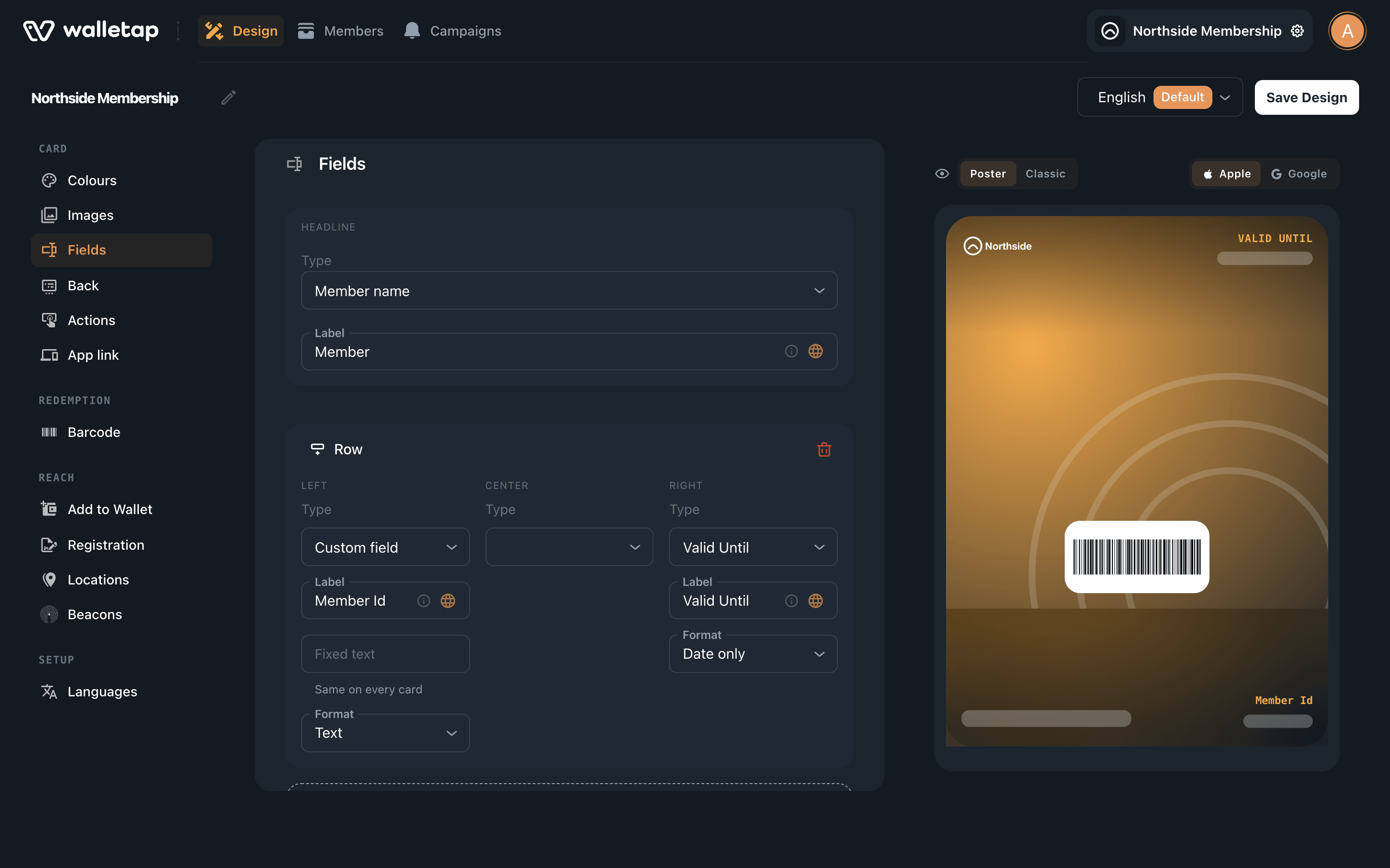
You edit fields on the template's Design tab, in the Fields and Back sections: TemplatesNorthside MembershipDesignFields.
The bands#
Logo — Your logo, and the logo text beside it.
Top row — Beside the logo. Up to three values; one reads best.
Header — The headline value, largest on the card.
Row — Supporting values. Apple shows four at most across the front.
Barcode — What staff scan. The text under it is optional.
Back — Any number of fields, links and phone numbers.
| Band | Holds | Apple Wallet | Google Wallet |
|---|---|---|---|
| Headline | One field | The large field under the logo | The card's header |
| Top row | Up to three fields | Beside the logo, right-aligned | The first row of the card |
| Row | Three positions: left, centre, right | The row under the headline | The next row of the card |
| Back | Up to 11 fields in the designer | The back of the pass | The pass details |
Some placement is decided for you:
- The headline moves off a banner. On Loyalty, Gift, Coupon and Event passes, Apple Wallet draws the headline over the banner. When such a pass has a banner, Walletap moves the headline up beside the logo, so it is never printed across the picture. Apple draws no banner on a Generic pass, so there the headline stays under the logo.
- The expiry goes to the corner. A built-in Valid Until field is shown in Apple's top row wherever you put it, because that is the part of a pass a holder can see without opening it.
- A wide logo replaces the title. Beside a square logo the pass shows its title; a wide logo fills that space, and the title is left out. See Artwork and colours.
Use Add top row and Add row to add a band, and the bin icon to remove one. A template holds one row; an Event ticket holds two. Older templates can carry more rows; the designer marks those Android only, because Google Wallet shows them and Apple Wallet does not.
Field types#
Each field has a Type. The menu lists, in order:
- Walletap's own fields (Generic only) — Member name, Arrivals used and Arrivals allowed. Walletap fills them: the name from the member's details, the arrivals from the membership and the door reader, which refuses entry once the allowance is used. See Door access.
- Built-in fields for the template type — the table below. Both wallets understand these natively, so use one wherever it fits.
- Custom field — a field you name yourself.
- No value — an empty position in a row, so the fields beside it keep their place.
| Template type | Built-in fields |
|---|---|
| Generic | Valid Until |
| Loyalty | Loyalty points, Reward points, Member name, Member Id, Reward tier, Secondary rewards tier, Valid Until |
| Gift | Balance, Card number, Balance updated, Pin, Event number, Valid Until |
| Event | Event start, Event end, Doors open, Event name, Venue name, Venue address, Gate, Section, Row, Seat, Ticket Holder, Ticket Type, Ticket Number, Confirmation Code, Fine print, Valid Until |
| Coupon / Offer | Valid Until, Offer Provider, Offer Details, Disclaimer |
On a stamp card, Reward points shows the number of stamps collected.
Label and fixed text#
Every field has a Label — the small caption above its value, such as POINTS.
A custom field in the top row or the row also has Fixed text ("Same on every card"). Use it for something that never changes, such as Tax and gratuity not included. On the back, a custom field has a Value box for the same purpose.
Dates#
Fields that hold a date have a Format: Date only, Date and time or Time only. A custom field can also be Text. A built-in date field, such as Event start, is always a date, so only its format can be chosen.
Where values come from#
A template describes the fields; each pass fills them in. A value reaches the pass in one of four ways:
| Source | Fields | How |
|---|---|---|
| Each pass | Member name, Member Id, Ticket Holder, Seat, Card number, Valid Until, custom fields without fixed text, and the like | Entered when the member is added or signs up, or sent through the API |
| Walletap | Loyalty points, Reward points, Balance, Arrivals used | Changed as staff stamp, add points, spend a balance or scan |
| The template | Event start, Event end, Doors open, Venue name, Venue address, Fine print | The same on every pass, set in Details. An Event name headline shows the pass title |
| Fixed text | Custom fields with fixed text | The same on every pass |
When a field has both a member's value and fixed text, the member's value wins. A field with no value at all is left off the pass rather than shown empty.
To collect a member's value for a field, bind a sign-up form field to it: in Registration, set the field's Pass field. The New member dialog and the public sign-up page then both ask for it. See Sign-up form and QR code.
Valid until: expiry or a date on the card#
There are two ways to show a date a pass is good until, and they behave differently.
- The built-in Valid Until field is the pass's expiry. Once the date passes, Apple Wallet and Google Wallet move the pass to their expired passes. Use it for things that end: an event ticket, a coupon.
- A Custom field labelled Valid until with the Date only format shows the date and nothing more. The pass stays in the wallet. Use it for renewable passes such as Northside Membership, where a renewal moves the date forward.
New Generic templates start with the built-in Valid Until in their row. Swap it for a custom field before issuing a membership that renews.
Field IDs#
Hover over the ⓘ at the end of a front field's Label to see its Field ID. It is
how the API and the sign-up form address the field. A custom
field's ID is made from its label as you type it — Locker number becomes
lockernumber.
While a custom field's ID still matches its label, editing the label changes the ID too. Passes already issued keep their value under the old ID, so the field disappears from them. Settle a custom field's label before you issue passes.
The back of the pass#
Click Add field in the Back section. Choose a built-in field, or Custom field and fill in Label and Value.
Walletap works out what a custom value is as you type it, and makes it tappable on the pass: a web address opens the page, a phone number dials, an e-mail address writes a message. Click the icon at the start of the Value box to choose the type yourself — Web page, Address, Telephone number, E-mail address or Text. Pick Address yourself for a street address.
Walletap also adds some lines to the back itself:
- campaign messages, at the top — see Campaigns;
- on a stamp card with rewards, a Next reward line — see Rewards;
- on Apple Wallet, Pass provider with your company name and Pass issuer, unless the pass is signed with your own Apple Developer credentials.
Actions#
Apple Wallet on iOS 27 shows up to two buttons beneath a pass. Add them in the Actions section: choose an Action — such as Order, Shop, Call, Directions, Book appointment or Offers and rewards — and the Link it opens.
App link#
The App link section puts your website or app on the pass. Web App URL becomes a button on Google Wallet, labelled with the Button text — write where it goes, such as Book a class. Android App links your app on Google Play.
The iOS 27 poster#
On iOS 27, Apple Wallet can draw a pass as a poster: your artwork fills the card and the fields sit on top of it. Generic, Loyalty, Gift and Coupon templates can use it. The pass still carries the classic design, which older iPhones show.
The poster uses the same fields, placed differently:
- the logo at the top left, and the first field of the top row at the top right — Apple draws only one there;
- the headline in large type at the bottom left, without its label;
- the other front fields beside it — Apple shows four fields there, headline included;
- the barcode below, and the same back.
A template with poster artwork uses the poster unless you choose otherwise. Switch the preview above the card between Poster and Classic to choose; the choice is saved with the design. Artwork and colours covers the artwork.
Languages#
In the Languages section, choose the Default language and add others under Also available in. Translate everything fills in a translation of every label and text. To edit one language, pick it in the language menu beside Save Design and change the text in place. Each wallet shows the language that matches the holder's phone, and falls back to the default.
Limits#
| What | Limit | Why |
|---|---|---|
| Headline | 1 field | Apple and Google |
| Top row | 3 fields; one reads best | Apple |
| Row | 3 positions; one row, two on Event tickets | Apple draws one row below the headline, two on an event ticket |
| Back | 11 fields | The designer |
| Actions | 2 | Apple |
| Poster | 1 field at the top, 4 in the main area | Apple |
| Label | About 15 characters | Apple shortens longer labels with an ellipsis |
| Front value | About 20 characters | Apple shortens longer values with an ellipsis |