Artwork and colours
Set a pass's colours, logo, icon, banners, stamps and iOS 27 poster artwork, with the sizes each wallet expects.
Colours and artwork are what make a pass recognisably yours in a wallet full of other cards. Each wallet draws images in fixed slots and crops what does not fit, so this page gives the shape and size each slot wants.
Before you start#
- Have your logo, ideally on a transparent background, and a square version of your mark for the icon.
- Any common image format works; the designer converts it to PNG. Each image can be up to 5 MB.
Set the colours#
Open the template's Colours section: TemplatesCoffee CardDesignColours.
| Colour | Used on |
|---|---|
| Background | The whole card, on both wallets |
| Label color | The small captions above each value — Apple Wallet |
| Text color | The values — Apple Wallet |
Until you pick a label or text colour, both follow the background: dark text on a light card, white text on a dark one. Picking either one switches that off, and Apple Wallet draws exactly the colours you chose. If one of them is hard to read on the background, the section warns you — for example The label colour may be hard to read on this background.
Two colours read best in a crowded wallet: a dark background tinted towards your brand, white text, and your brand colour on the labels. Harbour Coffee's card is a dark espresso brown with warm beige labels.
On a stamp card, collected stamps are drawn in the card's accent — the label colour you picked, or the background colour if you have not picked one — and empty slots stay neutral. The brand colour on your labels is also the colour of every stamp.
Add the images#
Open the Images section and drop a file onto each slot. Slots marked * are required. A slot marked with the Apple logo is used by Apple Wallet only.
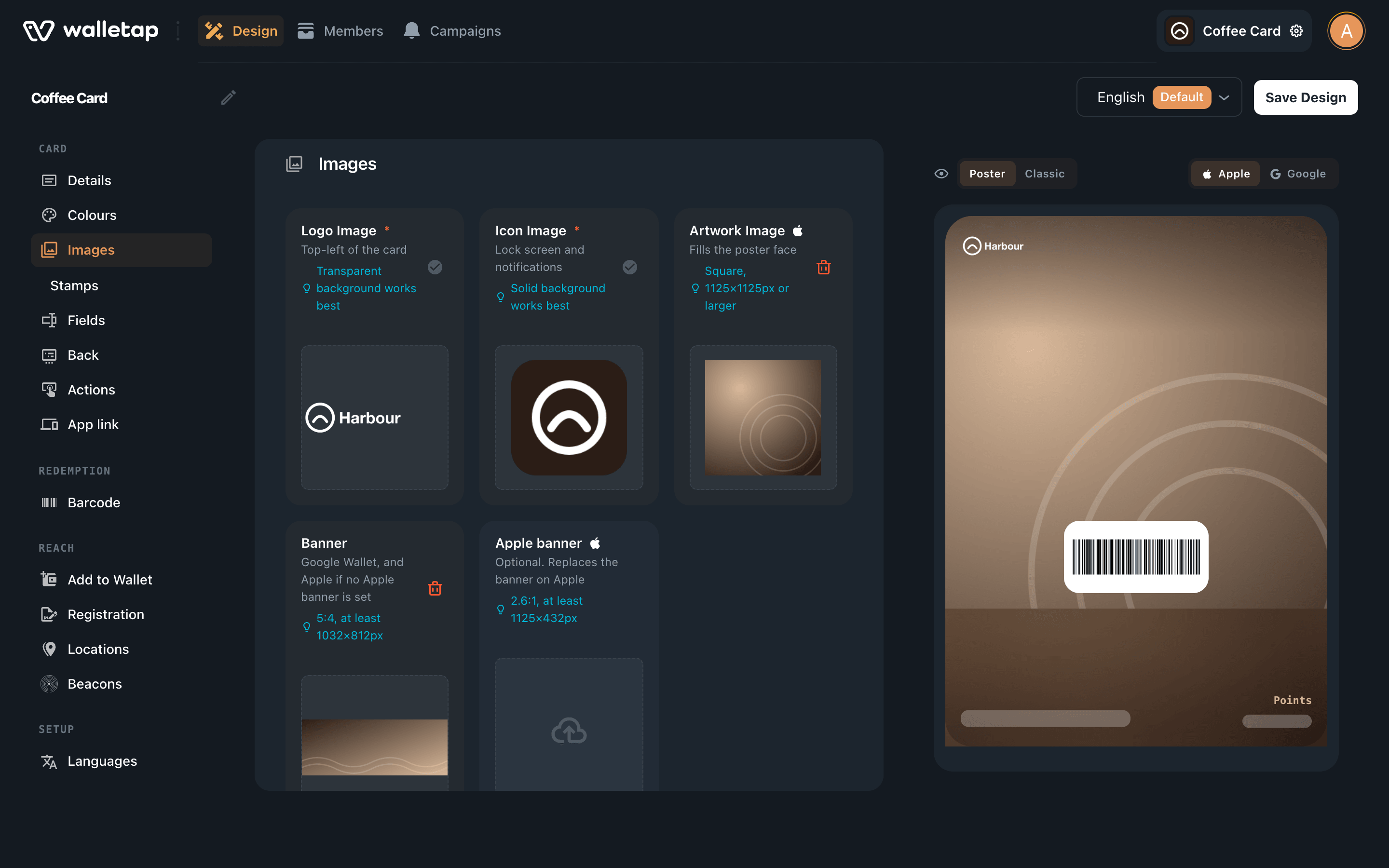
| Slot | Shows | Shape and size |
|---|---|---|
| Logo Image * | Top left of the card | Wide or square, on a transparent background. Wallet draws it up to 480 × 150 px |
| Icon Image * | Lock screen and notifications; Google's round logo when the logo is wide | Square, 87 × 87 px or larger, on a solid background |
| Banner | Google Wallet, and Apple Wallet unless an Apple banner is set | 5:4, at least 1032 × 812 px |
| Apple banner | Apple Wallet, in place of the banner | 2.6:1, at least 1125 × 432 px |
| Artwork Image | The iOS 27 poster | Square, 1125 × 1125 px or larger |
| Thumbnail Image | Corner of the card — Generic and Event, Apple Wallet | Square, up to 270 × 270 px |
| Background Image | Behind the whole ticket — Event, Apple Wallet | Portrait, up to 540 × 660 px |
Click Save Design when you are done.
Logo#
Walletap measures the logo when you add it. A logo more than a little wider than it is tall is treated as wide: it fills the top of the card and the pass title is left out beside it. A square logo leaves room for the title, which shows next to it.
With a wide logo, Google Wallet uses your icon in its round logo slot, so always add an icon too.
A logo on a solid coloured plate shows as a block of colour on the pass, on the sign-up page and in the add-to-wallet email. Use a transparent version where you have one. In the mobile app, the designer offers the forms it can make of an uploaded logo under Logo on the card:
- Original — exactly as uploaded;
- No background — the plate removed;
- One colour — the mark in a single colour that reads on your card.
When you change the background colour in the app, the logo switches to whichever form reads on it; tap another form to choose it yourself. Removing a background is a judgement about which enclosed areas are holes in the letters and which are part of the design, so check the result.
Icon#
Google Wallet shows the icon inside a circle and crops the corners. Leave a margin of about 15% around your mark so nothing is cut off.
Banners#
The banner is the wide picture across the card. One image cannot suit both wallets: Google wants a 5:4 picture, while Apple's banner is about 2.6:1, so Apple crops a 5:4 banner to a strip and loses its top and bottom. If that crop hurts your picture, add an Apple banner in Apple's shape as well.
- Apple Wallet shows a banner on Loyalty, Gift, Coupon and Event passes. A Generic pass on Apple Wallet has no banner.
- On an Event ticket, a Thumbnail Image or Background Image takes the banner's place on Apple Wallet.
- Keep text out of banners. Apple draws fields over the banner, and the headline moves to the corner when there is one — see Fields.
Stamps#
On a Loyalty template, the Stamps section turns the banner into a stamp card. Switch on Use stamp collection instead of banner image, set Number of stamps to display between 2 and 10, and upload a Stamp Image — a square mark such as a coffee cup, up to 360 × 360 px. On Apple Wallet's banner, up to five stamps sit in one row and six to ten are split over two. Google Wallet and the poster use the number of rows that makes each stamp largest.
Walletap draws the stamps onto your banner, so a stamp card needs a banner too. Reward milestones are set in the same section — see Rewards.
Poster artwork#
On iOS 27, Apple Wallet can show the pass as a poster, with the Artwork Image filling the card and the fields drawn on top. A template with artwork uses the poster unless you switch the preview to Classic. Fields lists what the poster shows.
The poster is taller than it is wide, so Wallet crops the sides of the square artwork, and the lower part sits behind the fields and the barcode. Keep the subject in the upper centre and leave text out of the picture. On a poster stamp card, the stamps are drawn onto the artwork.
Design in the mobile app#
When you create a Loyalty template in the app and choose Design manually, the How should it look? step shows the pass with a tile for each image under it:
- Logo — opens your photos.
- Banner, Stamp and Poster — open a gallery of ready-made artwork, with Upload your own at the end.
Below the tiles, pick a Background color from the swatches or choose Custom color, and on a stamp card set the Number of stamps.
If something goes wrong#
"That image is over 5 MB. Try a smaller one." — export the image smaller, or as a compressed format; the designer converts it to PNG either way.
"That file could not be used." — the file is not an image the browser can read. Save it as PNG or JPEG and try again.
The Google pass shows a placeholder mark instead of your logo — the logo is wide, so Google shows the icon, and the icon is still the placeholder. Add your own Icon Image.
Text on the card is hard to read on the poster — the poster draws text over your artwork using the card's colours. Choose a background, label and text colour that suit the picture, or switch the preview to Classic.